DEEP ROOTS HARVEST
// IDENTITY & PACKAGING
AGENCY // MIRRORBALL NEW YORK
BRAND // DEEP ROOTS HARVEST
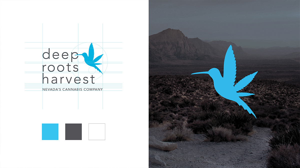
“THE HUMMINGBIRD
HAS BECOME THE MOST POPULAR LOGO IN THE INDUSTRY HERE IN
LAS VEGAS”
When this project came to us, you can believe we were excited. This was my, and the agencies, first dive into the cannabis sector, and we really wanted to hit it out of the park. The company is based out of Nevada and they are one of the largest suppliers and cultivators in the industry, so when they wanted a new identity –we dove right in.
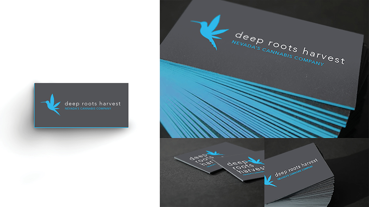
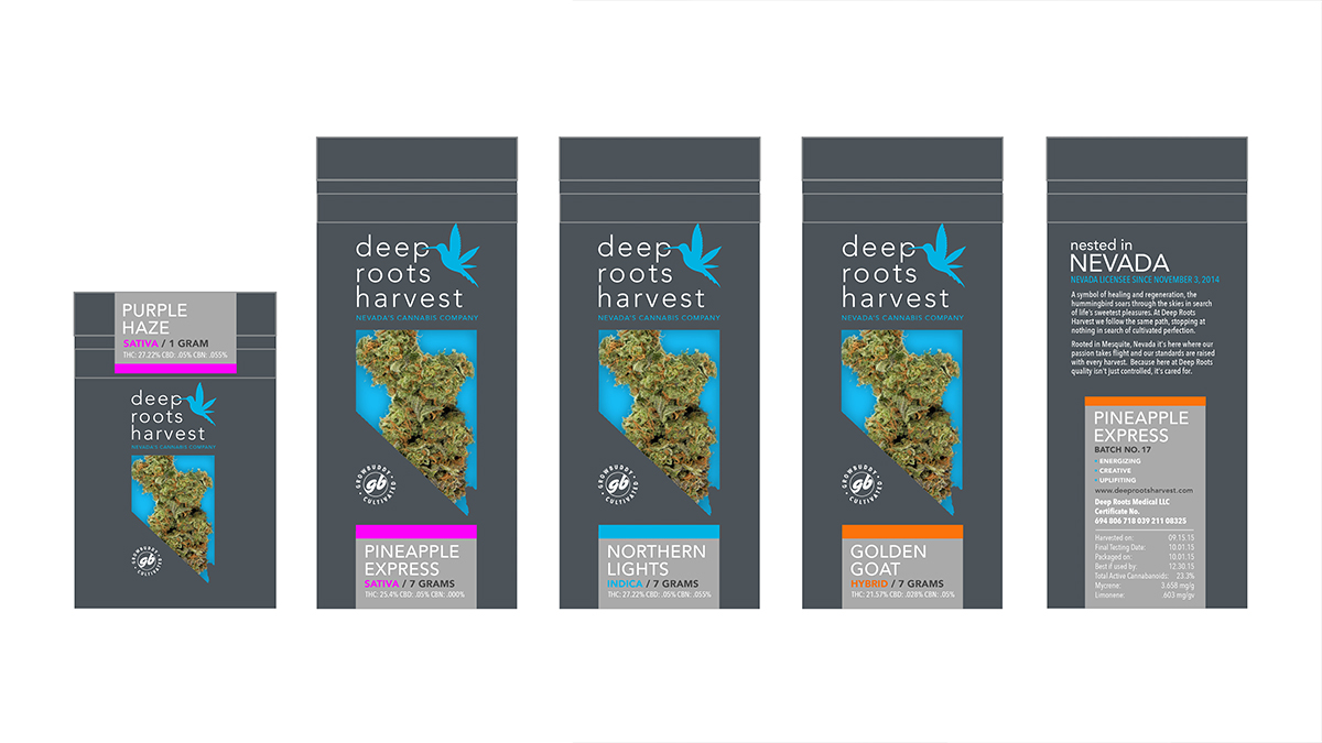
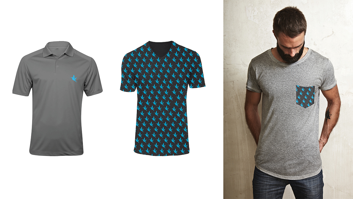
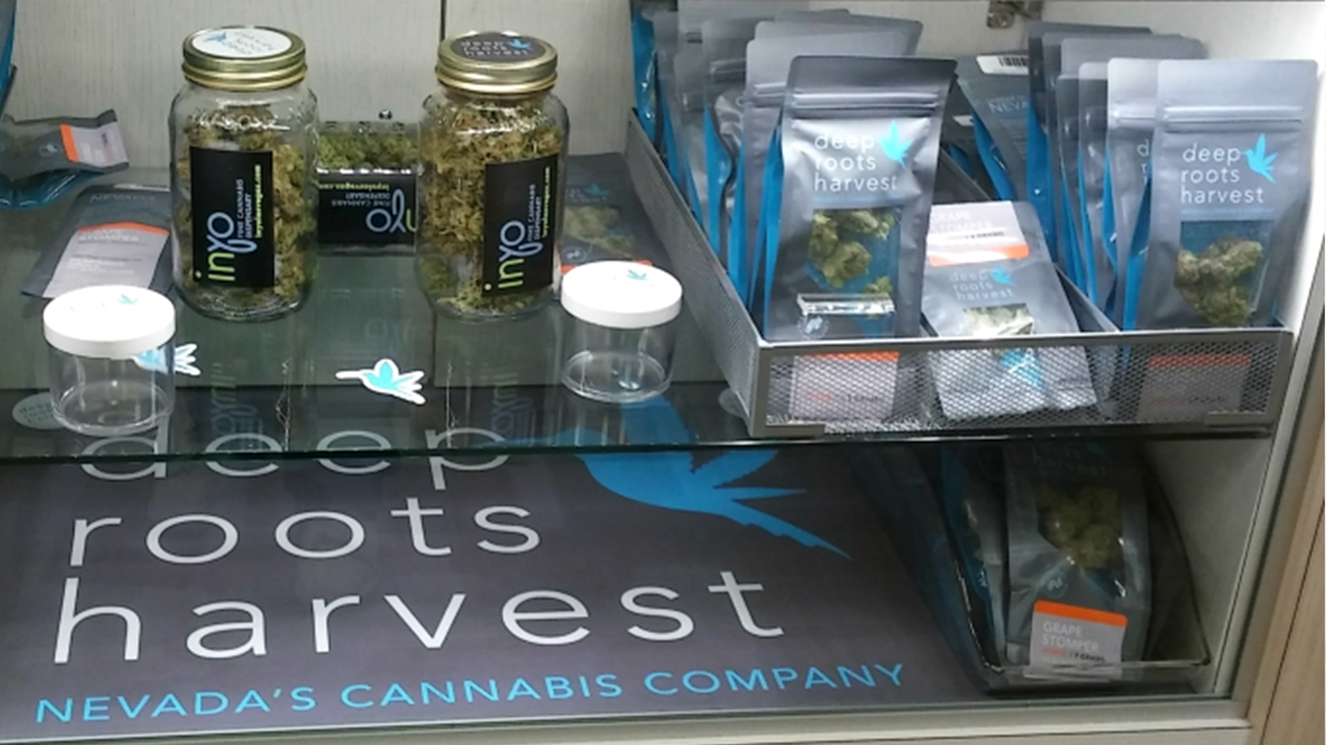
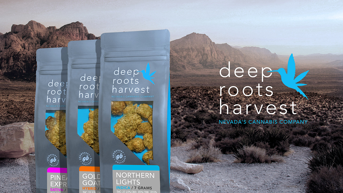
So the only thing that the owners had to show us to kick things off was an old business card they had done. It featured a traditional hummingbird on it, and because it was a special symbol to them, we didn’t want to lose it. They wanted modern, sleek, and iconic, while still speaking to the industry as a trusted cannabis production leader. The final design fused a cannabis leaf as the wings of the bird, while the color theory brought home the modern, trusted, big brand, emotion. We then developed a system for strain differentiation, as well as a tiered packaging model.
But lets face it, the best thing is getting an email from the client saying, “the hummingbird has become the most popular logo in the industry here in Las Vegas.”